Charting for beginner investors: recognising patterns
Our charting expert explains important chart patterns, price targets and what to do when you spot them.
4th November 2020 09:35
by Nicole Elliott from interactive investor
We’ve drawn lines and candlesticks. Now, in the fourth part of her introduction to technical analysis, charting expert Nicole Elliott explains the important chart patterns, price targets and what to do when you spot them.

How good are you at pattern recognition? I’m not talking about wallpaper or chintz – which you’ve probably chucked out years ago; I’m thinking money and forensics. Believe me, the UK Metropolitan Police has a dedicated department in Lambeth working on the subject – mainly fingerprints and facial recognition. Technical analysts have focused on the subject for a lot longer, in fact for at least 100 years. Why, you ask.
Underpinning their research is the idea that history repeats itself – not exactly, but that it leaves hints along the way in the form market price action takes. Whoever does the cooking at home will agree: when the price of onions soars (which it does regularly) you might either switch to garlic or do without. It’s a question of speed, percentage moves, and need.
Technical analysts monitor all of the above and believe that certain chart patterns reaffirm existing trends, or warn of an impending turn in sentiment – continuation patterns versus reversal patterns. These are usually interchangeable in bull or bear markets, being a mirror image of each other. Here, I shall focus on rising prices, but the reverse is valid - if perhaps swifter and more dramatic.
The simplest continuation pattern is a rectangle (and sometimes a square) - horizontal support and resistance over an indefinite period of time. Seen ideally in a uptrend, or bull trend, think of it as one of the staircase steps taking you higher; the treads mustn’t be too shallow and the risers not too high. Steady as she goes, that’s what we like. On a break above/below the pattern, to calculate the so-called measured price target, you measure the height of the rectangle, and then possibly its width.
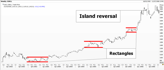
Source: Thomson Reuters Eikon. Weekly chart for GlaxoSmithKline. Past performance is not a guide to future performance
A variation on this is the triangle, be it symmetrical or its more aggressive cousin, the right-angled one. It’s a consolidation phase where both buyers and sellers are becoming more aggressive in their pricing – especially the ones at the sharp edge of the right-angle.
Here, the measured price target at the breakout point is the pattern’s height at its broadest.
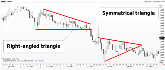
Source: Thomson Reuters Eikon. Weekly chart for GlaxoSmithKline. Past performance is not a guide to future performance
Other – and even more aggressive triangle style patterns – are the pennant and the flag. Think of the former as a small triangle on a stick (as on a golf course). The latter has a pole on which a flag must be drooping, as in real life. Measured price targets are the height of the pole, sometimes just two-thirds of it.
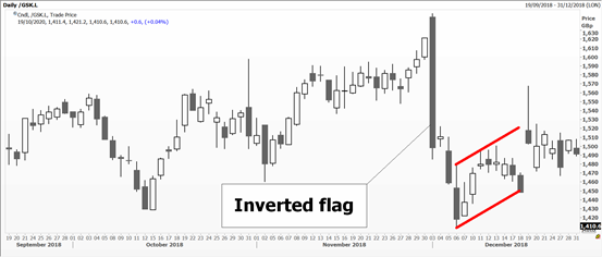
Source: Thomson Reuters Eikon. Daily chart for GlaxoSmithKline. Past performance is not a guide to future performance
One exception to triangles is the wedge, as in door-stop. In a bull market it points up after a rally, and in a bear market downwards. It is very difficult to trade because it’s actually a reversal pattern, marking an important top or bottom to the latest move.
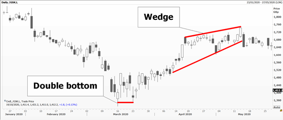
Source: Thomson Reuters Eikon. Daily chart for GlaxoSmithKline. Past performance is not a guide to future performance
It can also be associated with what we a false break, a move through a chart level which is then not sustained. In a candlestick chart these are often a shooting star or hammer.
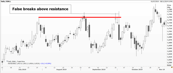
Source: Thomson Reuters Eikon. Daily chart for GlaxoSmithKline. Past performance is not a guide to future performance
Reversal patterns are followed by aficionados and known to many because they have good [and obvious] names. Double top - tried the upside twice and failed at about the same level; triple top: ditto. Sometimes market momentum just slows - and you end up with a sort of curling over rounded top; kids love its opposite: the rounded bottom. These are more frequent than the former because price action tends to be slower at lows than at highs.
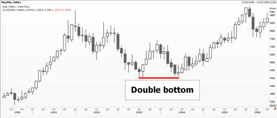
Source: Thomson Reuters Eikon. Monthly chart for GlaxoSmithKline. Past performance is not a guide to future performance
The most famous topping pattern is the Head & Shoulders [as in shampoo]. Like a triple top, but the central peak is higher than the other two, it has a neckline which is drawn between both central lows of the shoulders. The measured downside target is the distance between the top of the head and its neckline directly below, taken from a decisive break of the right shoulder’s neckline. I might be tempted to blame the hairdresser!
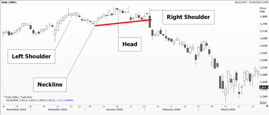
Source: Thomson Reuters Eikon. Daily chart for GlaxoSmithKline. Past performance is not a guide to future performance
An even more dramatic reversal is an island which consists of price gaps either side of an important high. Do remember that with all of the above, context is key. Triple tops or whatever must occur after a decent rally, and the pattern should be sort of in proportion of what came before it; think of rules of harmony and balance.
Gaps in themselves are important too. In a runaway market, prices often open above the previous day’s/week’s high creating a gap. The first one is called a ‘breakaway’ gap. If there is a second one shortly after, it’s known as a ‘mid-point’ gap – which warns you that you are probably half-way to the target of this very fast move. A third one is called ‘exhaustion’ – and, as might be expected, tells you that this recent spurt is nearly over.
To help you with all the patterns, do keep an eye on individual candlesticks that form them. Often, they give you advance warning of a turn.
Nicole Elliott is a freelance contributor and not a direct employee of interactive investor.
A graduate of the London School of Economics and Political Science (BSc social psychology), Nicole Elliott has worked in banks in the City of London for the last 30 years. Whether in sales, trading or forecasting, technical analysis has always been the bedrock of her thinking. Her key expertise lies within all areas of Treasury: foreign exchange, money markets, fixed income and commodities. She has also added to the body of knowledge of the industry, writing the first Western book on Ichimoku Cloud Charts. Strong media links and a cult following are due to her prescient calls on the markets and often entertaining format.
These articles are provided for information purposes only. Occasionally, an opinion about whether to buy or sell a specific investment may be provided by third parties. The content is not intended to be a personal recommendation to buy or sell any financial instrument or product, or to adopt any investment strategy as it is not provided based on an assessment of your investing knowledge and experience, your financial situation or your investment objectives. The value of your investments, and the income derived from them, may go down as well as up. You may not get back all the money that you invest. The investments referred to in this article may not be suitable for all investors, and if in doubt, an investor should seek advice from a qualified investment adviser.
Full performance can be found on the company or index summary page on the interactive investor website. Simply click on the company's or index name highlighted in the article.