Charting for beginner investors: how to trade using trend lines
Drawing lines on a chart in the right place could tell you a great deal about the future.
13th October 2020 10:07
by Nicole Elliott from interactive investor
Drawing lines on a chart in the right place could tell you a great deal about the future. In the third part of her introduction to technical analysis, charting expert Nicole Elliott tells us why and how investors can learn this skill.

Having educated novices to technical analysis throughout my career, giving many presentations and speaking at international conferences along the way, when I’m feeling very mean I kick off with a chart like this, telling them their job is to look for levels of support and resistance, then spotting trends.
The vast majority are keen to get going, rolling up their sleeves, sharpening their pencils and getting out their rulers (metaphorically speaking in today’s techno-centred world). The most eager students laugh when I tell them, ‘’stop right there!’’
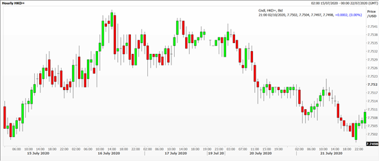
Source: Thomson Reuters Eikon. Hong Kong dollar vs US dollar Past performance is not a guide to future performance
Take a minute or two to give the chart a once-over, trying to get an overview of the landscape. (In fact, there’s a whole Japanese theory of technical analysis centred on this idea). See if there are any really salient features, squinting even to spot key issues. If there aren’t any, move on because forcing a chart to fit a narrative is a really bad idea.
Look at the vertical axis, measuring roughly the difference between the highest and the lowest prices; then calculate what this means as a percentage move. Ask yourself: is this statistically significant? Look at the price labels carefully, because they might give a clue as to what this instrument is. Next the horizontal axis, gauging how long a data series you have to hand.
Now that you’ve done this with the chart above, some conclusions you may have come to include: the thing started at 7.7500, rallied to 7.7550, and dropped all the way back down. The price has something to do with the US dollar and HKD. Price action takes place over 5½ working days (the ½ is Sunday evening trading). I’ll tell you now, this is the exchange rate of how many Hong Kong dollars you need to buy one US dollar. A move of 0.0050, half a Hong Kong cent, is irrelevant. The currencies have been pegged since 1984, but there is a little room for manoeuvre - two cents.
Now we start drawing lines – not on this chart, but one for Royal Dutch Shell (LSE:RDSB), one of the world’s largest oil companies.
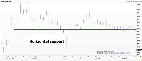
Source: Thomson Reuters Eikon. Royal Dutch Shell Past performance is not a guide to future performance
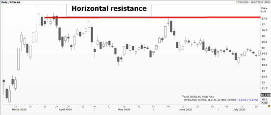
A horizontal support level is one where prices seem to drop to and then bounce. Its inverse is a horizontal resistance level where prices rally to, then get no further and retreat. The levels are not an exact science but are eyeballed, so experience and intuition will dictate how one draws the lines.
Source: Thomson Reuters Eikon. Royal Dutch Shell Past performance is not a guide to future performance
These horizontal levels can be extended into the future – forever. In fact, experienced technicians don’t usually pencil them in, but just keep them in mind; sometimes, but not necessarily, they can be round numbers – like crude oil at $50 per barrel or gold at $2,000 per ounce. The trading strategy is, where possible, to continuously enter and exit the market using the horizontal levels as triggers for a new trade.
So, if an investor is monitoring a stock with a view to buying, they might want to know if the share price is at or near the horizontal support line. If it is, and all things being equal, it might be another indicator that supports the ‘buy’ case.
If a shareholder is looking to sell a stock, and the share price is at or near horizontal support, they might wait for an expected bounce off the support level in order to sell at a higher price.
For horizontal resistance, an investor might typically be reluctant to buy a stock that is at or near the line of resistance, believing that there is a greater risk of the share price falling back. The investor might decide to wait and buy the shares more cheaply should they rebound lower from the line of resistance. A shareholder looking to exit their position might use the resistance level as an obvious place to sell.
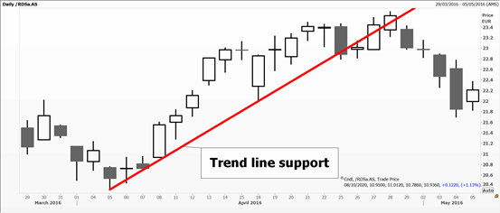
Next, we draw trend lines.
In a bull market we aim to join a minimum of three lows, starting from an important base. Subjectivity and time horizon come in here, deciding what are key levels and whether to stick with the lows or to focus on the bodies of the candlesticks - rather than their wicks.
Source: Thomson Reuters Eikon. Royal Dutch Shell Past performance is not a guide to future performance
In a market where prices are dropping, we join three significant high points.
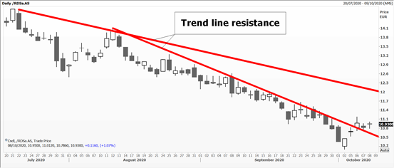
Source: Thomson Reuters Eikon. Royal Dutch Shell Past performance is not a guide to future performance
Remember this, because you’re bound to see charts where, in a rally, highs are joined, and, on the downturn, lows are drawn together. This is WRONG!
The principle with trend lines is the same as with support and resistance levels in that they can give a good idea of where a share price might go in future. Of course, trend lines get broken, and a new trend begins. We’ll talks more about so-called ‘breakouts’ and ‘fakeouts’ in a future article.
Trading the channel
What we can do is draw a parallel from the original lines, above on the way up and below on the way down. Unsurprisingly, these are called trend channels, where the original line is far more important than its shadow. Think train tracks which might deviate on the weaker (less important) edge.
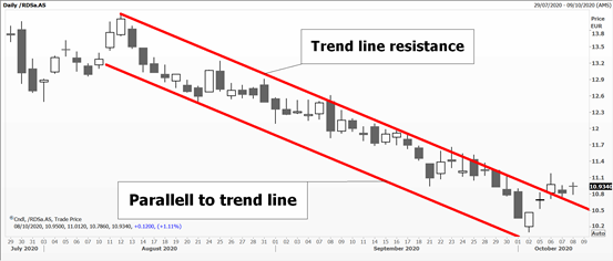
Source: Thomson Reuters Eikon. Royal Dutch Shell Past performance is not a guide to future performance
Another channel idea comes from mathematics, where a central mean regression line is calculated based on observed prices, then bands either side of this, based on one or two standard deviations around the mean, are added.
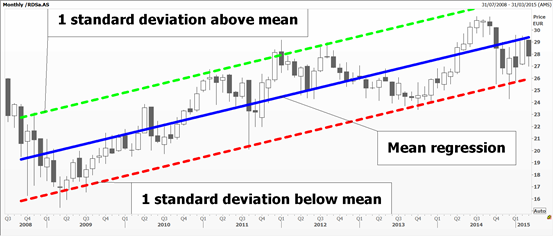
Source: Thomson Reuters Eikon. Royal Dutch Shell Past performance is not a guide to future performance
An Andrews pitchfork is similar, but instead of being calculated, it is for the eye to draw.
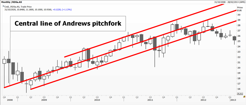
Source: Thomson Reuters Eikon. Royal Dutch Shell Past performance is not a guide to future performance
Starting with a significant high (or low), a central line is drawn as a ‘best fit’, then two parallels – of any width – are drawn either side, creating a three-pronged fork.
The reason for drawing any lines is to a) be aware of the underlying trend and to trade with it (because it makes life, and profits, so much easier) and b) to watch when things start to break down and the existing trend might no longer be valid. On daily or weekly closes below – or above – any line, you’ve been warned that the market is changing its nature and your thinking and strategy should adapt to the new circumstances.
In a later article we’ll go into more detail as to what to do when lines stop working.
Nicole Elliott is a freelance contributor and not a direct employee of interactive investor.
A graduate of the London School of Economics and Political Science (BSc social psychology), Nicole Elliott has worked in banks in the City of London for the last 30 years. Whether in sales, trading or forecasting, technical analysis has always been the bedrock of her thinking. Her key expertise lies within all areas of Treasury: foreign exchange, money markets, fixed income and commodities. She has also added to the body of knowledge of the industry, writing the first Western book on Ichimoku Cloud Charts. Strong media links and a cult following are due to her prescient calls on the markets and often entertaining format.
These articles are provided for information purposes only. Occasionally, an opinion about whether to buy or sell a specific investment may be provided by third parties. The content is not intended to be a personal recommendation to buy or sell any financial instrument or product, or to adopt any investment strategy as it is not provided based on an assessment of your investing knowledge and experience, your financial situation or your investment objectives. The value of your investments, and the income derived from them, may go down as well as up. You may not get back all the money that you invest. The investments referred to in this article may not be suitable for all investors, and if in doubt, an investor should seek advice from a qualified investment adviser.
Full performance can be found on the company or index summary page on the interactive investor website. Simply click on the company's or index name highlighted in the article.