Charting for beginner investors: the indicators chartists love
Charting expert Nicole Elliott look at how to predict future price movements.
11th November 2020 11:44
by Nicole Elliott from interactive investor
In the fifth part of her introduction to technical analysis, charting expert Nicole Elliott explains the main indicators used by professionals to help predict future price movements.

First and foremost, chartists begin by plotting price action. They are looking for trends and gauging whether they are sustainable, peeking round the corner for turning points, and, more importantly, estimating the levels of fear and greed of those involved – investors’ core psychology.
A series of secondary data can be used to back up views based on price alone. The most obvious is volume, where a break of a chart pattern on high volume is more valid than if it occurred on a trickle of trades.
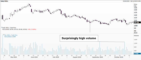
Source: Thomson Reuters Eikon. Daily chart for Vodafone. Past performance is not a guide to future performance
Futures contracts can be a good indicator here. They track so-called open interest - how many overnight positions are being held. This helps sift short-term speculators from more serious investors.
For the more sophisticated chart watcher, plot the implied volatility being used to price the cost of an option; this is the key number to calculate all insurance cover. It’s defined as the premium as a proportion of face value of the item to be insured, which tells you how keen/desperate/reluctant buyers and sellers of options are.
For the S&P 500 index there is a futures contract which reflects the cost of a parcel of options and it’s called the VIX. You may also hear it referred to as the volatility index or fear index as its value tends to shoot up when financial markets are falling.
- Why reading charts can help you become a better investor
- Charting for beginner investors: candlesticks and how to use them
- Charting for beginner investors: how to trade using trend lines
- Charting for beginner investors: recognising patterns
One step removed are the oscillators. There are many of these and are a mathematical manipulation of raw price data. A simple moving average is the most basic. You take the closing price over the last X number of days/weeks/hours, with 10,20,50 and 200 days being the most popular. Add these up and divide by the number of data points. The following day, do the same but ditch the first data point and adding the latest one.
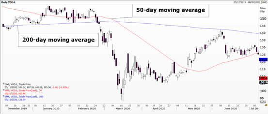
Source: Thomson Reuters Eikon. Daily chart for Vodafone. Past performance is not a guide to future performance
Stockbrokers often recommend buying shares whose price is above the 200-day moving average and selling those below it. Technical analysts tend to favour a crossover method and use two moving averages. When the shorter one dips below the longer term one a sell signal is generated; a buy signal is generated when the short one crosses above the long one. Very much a trend following system.
The Relative Strength Index (RSI) tries to decide whether an instrument has become overbought or oversold, not compared to its peers but by measuring the internal dynamics of price changes. Closing prices over the last 14 days are used, their rate of change from one day to the next measured, giving a score between zero and 100. A reading over 70 warns that it has become overbought and the bullish trend might fizzle out soon. A value below 30 warns that a selling climax could occur imminently. In very volatile markets readings of 20 and 80 are used.
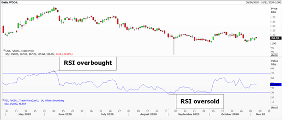
Source: Thomson Reuters Eikon. Daily chart for Vodafone. Past performance is not a guide to future performance
A similar measure is the Rate of Change (ROC) momentum indicator, which measures the rate of change in closing prices over a given period of time, most often 10 days or 10 weeks. If its value is positive, momentum is bullish, the higher the reading the greater the acceleration. Conversely, a negative reading means momentum is bearish, the bigger the number the more bearish the trend. Note: there are no upper or lower limits to this system.
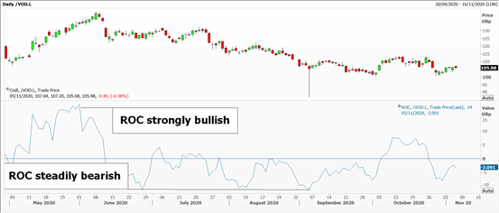
Source: Thomson Reuters Eikon. Daily chart for Vodafone. Past performance is not a guide to future performance
Moving Average Convergence Divergence (MACD to fans) uses two exponential moving averages, where more weight is given to the most recent prices. The two lines are continuously converging or diverging, the shorter one being faster than the longer moving average.
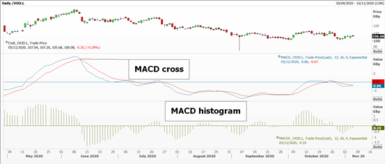
Source: Thomson Reuters Eikon. Daily chart for Vodafone. Past performance is not a guide to future performance
Buy and sell signals are generated when the lines cross over each other – as with a conventional moving-averages. I like to plot the MACD as a histogram, columns above or below the zero line measuring the distance between the two lines. All values above zero are bullish, but watch to see if they’re shrinking, or the inverse in a bear market.
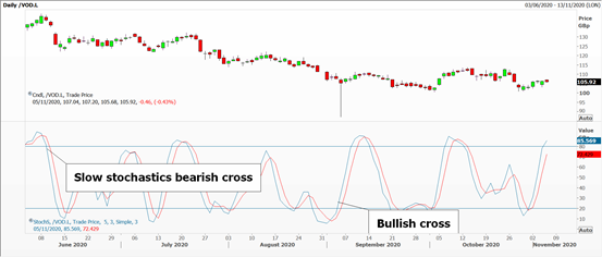
Another popular two-line oscillator are Stochastics. The concept behind this is that in a rising market the closing price tends to be towards the higher end of the day’s range; in a downtrend it is towards the lows.
The fast stochastic uses just five days’ data, plotting the latest close as a percentage of the range over the last five days. Against this there is plotted a three-day smoothed average of the first line - the slow stochastic.
I find the slow stochastic more useful because it uses the three-day line plus a three-day moving average of that, meaning that its progress is slower but steadier. Readings will be between 0 and 100, the levels at 20 and 80 ringing alarm bells of. A sell signal is initiated when the shorter period drops below the longer period line at the top of the range; vice-versa at the lows and the short line is higher than the longer one.
Source: Thomson Reuters Eikon. Daily chart for Vodafone. Past performance is not a guide to future performance
I would caution against using too many oscillators. While one might think they’d add weight to a market view, I find they can lead one to miss the wood for the trees; worse still, cause paralysis. So, pick a handful of ones you like and trust, and use them rigorously.
Averages and oscillators are very popular with the younger members of the trading community. That’s because they can programme them into computers and optimise them by, say, opting for a 20-day RSI or a 25 and 40-day moving average crossover. This forms the basis of one’s parameters for programme trading.
These secondary indicators are well used and liked, and today come as standard components of most chart software packages.
Nicole Elliott is a freelance contributor and not a direct employee of interactive investor.
A graduate of the London School of Economics and Political Science (BSc social psychology), Nicole Elliott has worked in banks in the City of London for the last 30 years. Whether in sales, trading or forecasting, technical analysis has always been the bedrock of her thinking. Her key expertise lies within all areas of Treasury: foreign exchange, money markets, fixed income and commodities. She has also added to the body of knowledge of the industry, writing the first Western book on Ichimoku Cloud Charts. Strong media links and a cult following are due to her prescient calls on the markets and often entertaining format.
These articles are provided for information purposes only. Occasionally, an opinion about whether to buy or sell a specific investment may be provided by third parties. The content is not intended to be a personal recommendation to buy or sell any financial instrument or product, or to adopt any investment strategy as it is not provided based on an assessment of your investing knowledge and experience, your financial situation or your investment objectives. The value of your investments, and the income derived from them, may go down as well as up. You may not get back all the money that you invest. The investments referred to in this article may not be suitable for all investors, and if in doubt, an investor should seek advice from a qualified investment adviser.
Full performance can be found on the company or index summary page on the interactive investor website. Simply click on the company's or index name highlighted in the article.