Spider charts aim to stop trust investors getting in a spin
24th June 2022 14:00
Kepler Trust Intelligence unveils a new system for showing how an investment trust performs against peers on critical metrics.

This content is provided by Kepler Trust Intelligence, an investment trust focused website for private and professional investors. Kepler Trust Intelligence is a third-party supplier and not part of interactive investor. It is provided for information only and does not constitute a personal recommendation.
Material produced by Kepler Trust Intelligence should be considered a marketing communication, and is not independent research.
They say that sharks die if they stop moving. It turns out this is only true of obligate ram breathers such as the great white, many other sharks will be just fine. That said, one of our latest innovations to ensure our site doesn’t go the way of MySpace or Digg is the KTI Spider Chart, which we have been steadily rolling out in our notes on individual investment trusts.
This is a series of quantitative screens which aim to show how a trust performs versus its peers on what we think are critical metrics for investors: performance, consistency, diversification, downside protection and risk. No investment process is likely to be entirely based on quants, but we think they have a crucial role to play.
Our system should hopefully help investors understand how trusts perform versus their benchmarks and peers, whether they perform how the managers intend, and how they might fit together with other investments with different characteristics in a diversified portfolio. Below, we spell out how this system works and highlight some trusts that perform well on the underlying metrics.
Objective and general considerations
We like to think of trusts as attracting the elite in investment management, and just as the Premier League only contains 21 top-class teams and Manchester United, there are a relatively small number of investment trusts compared to open-ended funds. One of the issues with quant metrics is that you need a decent sample size to get meaningful results. However, some IT sectors contain just a couple of trusts, meaning restricting our analysis to a sector level would be pointless. As a result, we have drawn up 13 larger peer groups which we think allow for meaningful comparison. As an example of how this works, China trusts are considered alongside emerging markets trusts, while global sector or theme trusts like commodities and environmental are considered alongside global trusts. All scores on our metrics are normalised to the relevant peer group, so a score of 9/10 means the trust is in the 10th percentile of our expanded peer group.
It is important to note that this exercise isn’t an attempt to recreate a superior performance table or to rank trusts in order to award prizes. Rather, we hope to illuminate the return profiles of individual options, which should be useful for investors in a number of ways. For example, global small-cap trusts will be expected to have higher risk metrics than global large-cap trusts, and so by including them in a sector together, we are not attempting to make small-caps look worse but illustrate the differences in the proposition. Conversely, we believe, in general, small-cap funds should perform better versus their benchmarks thanks to the latter markets being less efficient, and so it may be that global small-cap trusts end up looking better than large caps on the performance metric. Or maybe not? The beauty of a quant system is it allows us to test theory and think through why it might have been wrong.
We are acutely aware that all quantitative metrics are backwards-looking, which it should go without saying means they need careful interpretation in light of changing market environments. Growth strategies have done very well in recent years but may not do so over the next five years. While our metrics look over five years, we have looked at rolling one-year periods in that time where appropriate, which should hopefully limit the influence of any one short, sharp movement in markets. However, longer-term trends which last for most or all of our five-year window will influence the results, and future market conditions could be very different. Hopefully, the data we present will allow investors to reason why and how a trust has performed in a certain way in conjunction with the more qualitative elements of our research. This should allow reasoning about future behaviour patterns and also about how different trusts might be used together in the same portfolio. Below we run through the key categories in the spider chart and the underlying metrics the scores are based on.
1) Performance
For active funds, we think the most useful metric to look at is relative performance. As a result, our spider chart doesn’t answer the question of whether an investment has been successful in absolute terms. Rather, we look at alpha versus a benchmark over rolling one-year periods, calculated monthly. Alpha is a risk-adjusted metric as it considers the beta of a portfolio. It is easy to outperform in a rising market: just buy the market and gear up. This doesn’t reflect any skill on the part of the manager, however. The performance we are trying to capture is that which is dependent on the decisions of the manager. However, it is impossible to be a purist about this. All managers work to a basic style and process which will be better suited to certain market environments. Deviating from this would be worrying for the most part, even if it leads to short-term underperformance. As a result, our scores include returns due to style and process too, and so need interpretation.
For a number of reasons, we have used a common benchmark within our sectors. This allows us to avoid passing judgement on the individual benchmarks a manager has selected. It also means investors are being given a picture of each metric relative to a broad index which represents a passive allocation to that sector. Thinking like an investor, many will work to a basic asset allocation and then fill in with portfolios investing in the underlying markets – in other words, they will decide to invest 10% in Europe and then make a decision between value, growth, small-cap etc. Our system builds a picture of the sector which should be useful in making such a decision.
One of the top performers in absolute terms over the latest five-year period (which ended in March 2022) was Allianz Technology Trust (LSE:ATT). ATT sits in the global super-sector. Overweighting tech was a great decision over the past five years, and ATT was the best investment trust to have invested in from that perspective. As the below spider chart shows, the outstanding performance was delivered with average risk for the super-sector and average downside protection. ATT offered less than average diversification though. We discuss all these metrics in detail below, but briefly, the diversification metric looks at correlation versus key building blocks of the average investor’s portfolio. As a result, ATT’s low score reflects the fact that tech has been riding a macro wave and driving the performance of the global index. This highlights an interesting consideration with a sector fund; when it is performing well, it is unlikely to provide diversification to broad market funds.
KTI SPIDER CHART
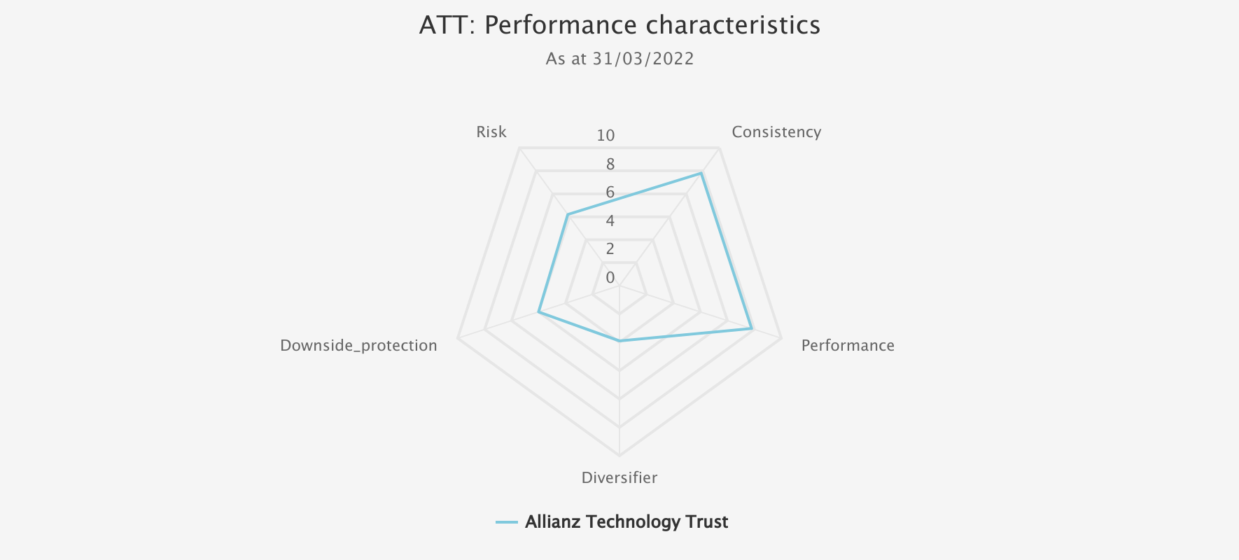
Source: Morningstar, Kepler calculations. Past performance is not a reliable indicator of future results
Another trust that stands out in terms of performance is JPMorgan UK Smaller Companies (LSE:JMI). As there are 18 UK small-cap trusts, it is meaningful to consider them in a sector alone. JMI has the second-best score for performance in that sector, which it couples with the second-best consistency score. The trust has performed very well on a consistent basis versus its benchmark and peers but has also taken on more risk than the sector average, as our spider chart below shows. JMI is another trust with a growth bias, and this will likely have contributed to the low score for diversification.
KTI SPIDER CHART
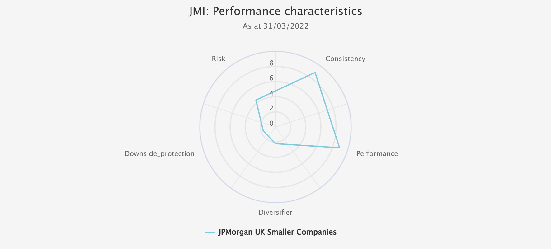
Source: Morningstar, Kepler calculations. Past performance is not a reliable indicator of future results.
2) Diversifier
Our diversification metric looks at correlation versus three indices. We look at the sector benchmark, a global equity index and a global bond index. The latter two give a picture of how a trust has diversified the two core exposures in the typical mixed-asset portfolio built around bonds and equities. It is a particularly interesting metric to look at over the past five years during which we have seen long-duration bonds and growth equities perform in a correlated fashion, with the duration of bond indices rising and the weight of growth equities in stock benchmarks also rising. It is important to remember that we are not looking at correlations on an asset class level but relative to the peer group. Our analysis will highlight which trusts add greater diversification benefits versus the other options in their key categories. Finally, we have also looked at diversification versus the super-sector benchmark as another way of recognising differentiated performance within the peer group.
An interesting example of strong diversification which has been delivered alongside good performance is Diverse Income Trust(LSE:DIVI). The data underlying the below chart shows that DIVI’s correlation to the benchmark was around the middle of the pack, but the trust displayed a very low correlation to global equities and global bonds over the period of review. This is likely to be due to Gervais Williams’ strategy of avoiding high-duration equities and preparing for a shift in the market environment which should favour smaller, shorter duration and less globalised companies (for more detail on the thesis see our latest note). It is notable that DIVI performed very well in terms of risk and downside protection too. This has been aided by the manager’s purchase of puts on the FTSE 100 Index.
KTI SPIDER CHART
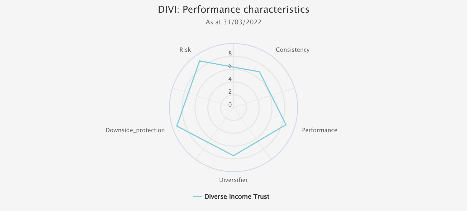
Source: Morningstar, Kepler calculations. Past performance is not a reliable indicator of future results.
3) Downside protection
Our downside protection category looks at a combination of the trust’s performance in the worst five months for the benchmark and the downside capture ratio versus the benchmark. Here we are trying to uncover which trusts have performed better in their relevant super-sector when the market has fallen out of bed. This is likely of great interest to investors, given the current environment! However, it has to be borne in mind that economic environments change, and the next crash might not be like the last one.
DIV has performed well on this metric, as discussed above. Another standout performer is Ruffer Investment Company (LSE:RICA). RICA also used derivative strategies to protect from certain scenarios, although the crucial positions have been in credit derivatives rather than equities in recent years. One interesting thing that comes out of the below spider chart is how lumpy the returns have been. This comes through in the low score for consistency. This is contributed to by the derivatives and some other defensive positions, which have led to sharp upturns in performance at times of market stress. There have also been periods of quite dull performance as markets have trended gently up, most notably in the earlier part of the five-year period in review.
KTI SPIDER CHART
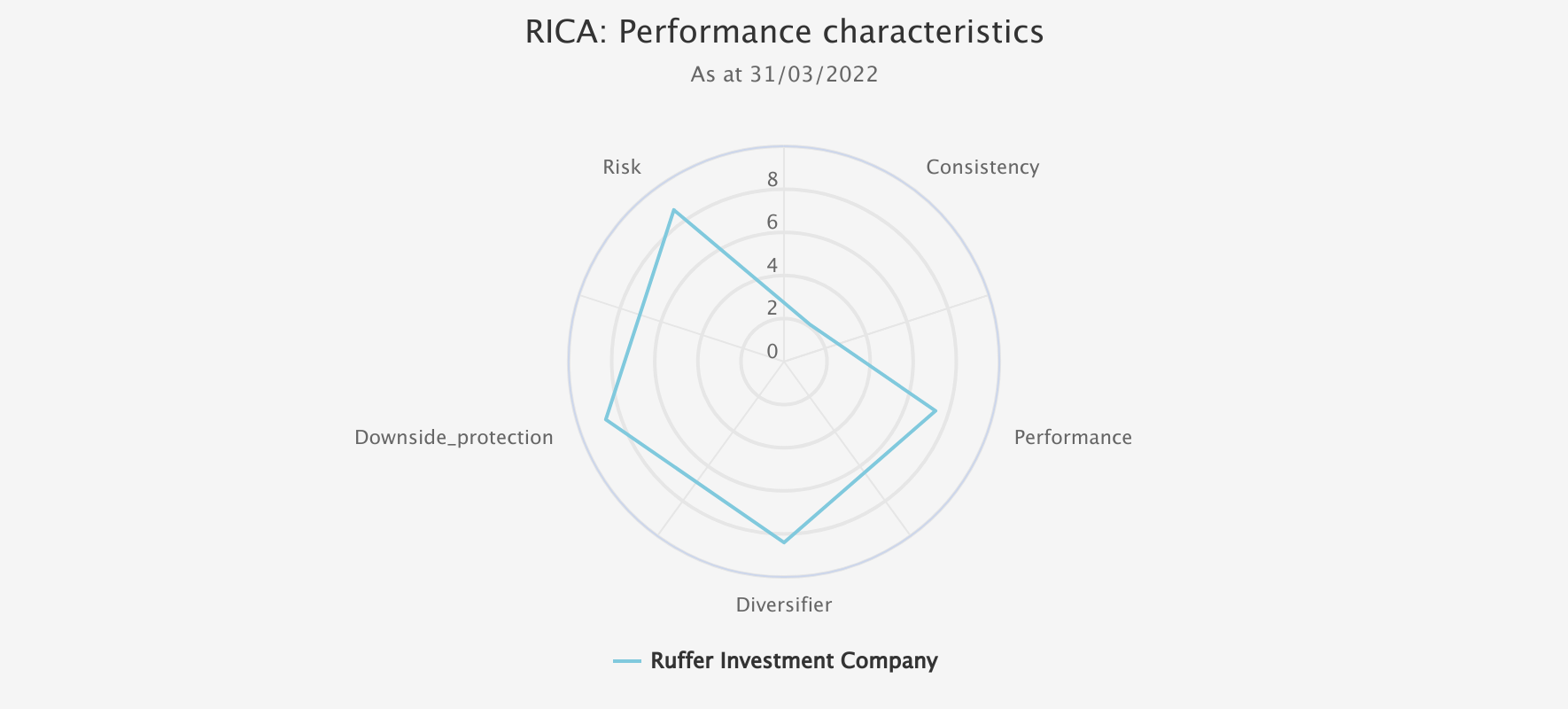
Source: Morningstar, Kepler calculations. Past performance is not a reliable indicator of future results
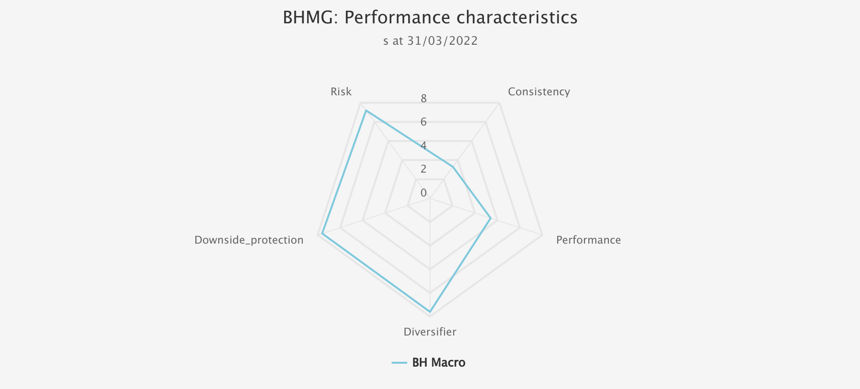
4) Risk
Our risk metric looks at volatility, the most used risk metric in the market, along with the ratio of the maximum drawdown to the trust’s annualised returns (a calculation similar to the less often used Calmar ratio). This latter metric looks at how bad the worst periods are versus the average return experienced and is intended to temper price volatility with a way of considering how the worst returns have compared to the usual experience – how big the shock has been when things go wrong, and so arguably what risk has been hidden in the low volatility environments.
As the below chart shows, BH Macro (LSE:BHMG) looks exceptional on this metric, as well as downside protection and diversification. The relatively low consistency score reflects the strategy which focuses on identifying trades with an asymmetric risk profile, i.e. which have a relatively low cost if they fail but lead to significant gains if they succeed. This means that while performance over five years, on rolling one-year periods, has been average, these returns have tended to come when you really need them.
KTI SPIDER CHART
Source: Morningstar, Kepler calculations. Past performance is not a reliable indicator of future results.
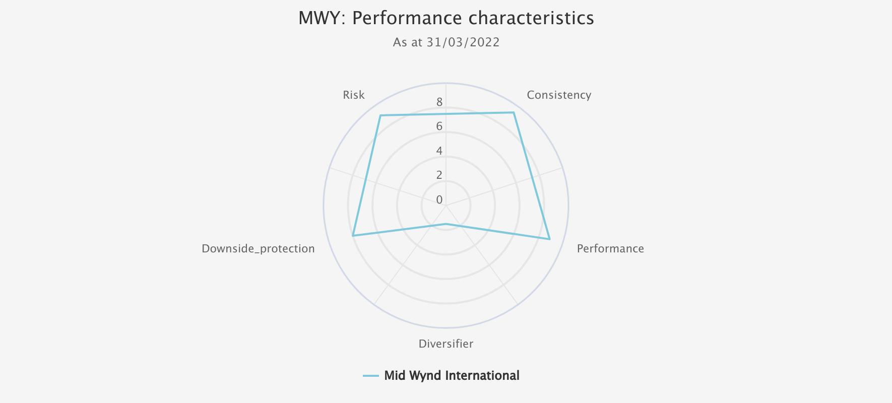
5) Consistency
Finally, we have looked at consistency, for which we look at the hit rate. This calculates how many positive months versus the benchmark there have been in the period and gives a better picture than performance as to whether gains are eked out month over month or delivered over longer market environments. Mid Wynd International (LSE:MWY) is one to stand out on this metric, as the below chart shows. Mid Wynd has managed to generate consistent outperformance with relatively low risk in the global super-sector. It has offered little diversification benefit though, which may reflect the fact the growth bias of the trust has been in tune with the dominant factor driving equity markets, which comes through in high correlation to world equities and the trust’s own benchmark.
KTI SPIDER CHART
Source: Morningstar, Kepler calculations. Past performance is not a reliable indicator of future results
Conclusions
In looking over five years, we have tried to give enough time for different market environments to play out. However, by rebalancing quarterly, we hope to ensure we capture the most recent trends as they happen. It may be illuminating for regular readers to look back at past notes and see how these charts have changed over time once they have been running for a few quarters. How stable the scores are, meaning how stable trust behaviour is and the relative performance between peer groups, will be very interesting to find out.
It should go without saying that there is no final answer on what behaviour to expect from a trust, no matter how pronounced characteristics have been in the past. Markets are so fascinating because they are endlessly changing, derived as they are from the richness of human ingenuity and psychology. Perhaps the recent turmoil in financial markets reminds us of the need to remain diversified and focus on hidden risks, and hopefully, our spider charts will aid in that endeavour.
Kepler Partners is a third-party supplier and not part of interactive investor. Neither Kepler Partners or interactive investor will be responsible for any losses that may be incurred as a result of a trading idea.
These articles are provided for information purposes only. Occasionally, an opinion about whether to buy or sell a specific investment may be provided by third parties. The content is not intended to be a personal recommendation to buy or sell any financial instrument or product, or to adopt any investment strategy as it is not provided based on an assessment of your investing knowledge and experience, your financial situation or your investment objectives. The value of your investments, and the income derived from them, may go down as well as up. You may not get back all the money that you invest. The investments referred to in this article may not be suitable for all investors, and if in doubt, an investor should seek advice from a qualified investment adviser.
Full performance can be found on the company or index summary page on the interactive investor website. Simply click on the company's or index name highlighted in the article.
Important Information
Kepler Partners is not authorised to make recommendations to Retail Clients. This report is based on factual information only, and is solely for information purposes only and any views contained in it must not be construed as investment or tax advice or a recommendation to buy, sell or take any action in relation to any investment.
This report has been issued by Kepler Partners LLP solely for information purposes only and the views contained in it must not be construed as investment or tax advice or a recommendation to buy, sell or take any action in relation to any investment. If you are unclear about any of the information on this website or its suitability for you, please contact your financial or tax adviser, or an independent financial or tax adviser before making any investment or financial decisions.
The information provided on this website is not intended for distribution to, or use by, any person or entity in any jurisdiction or country where such distribution or use would be contrary to law or regulation or which would subject Kepler Partners LLP to any registration requirement within such jurisdiction or country. Persons who access this information are required to inform themselves and to comply with any such restrictions. In particular, this website is exclusively for non-US Persons. The information in this website is not for distribution to and does not constitute an offer to sell or the solicitation of any offer to buy any securities in the United States of America to or for the benefit of US Persons.
This is a marketing document, should be considered non-independent research and is subject to the rules in COBS 12.3 relating to such research. It has not been prepared in accordance with legal requirements designed to promote the independence of investment research.
No representation or warranty, express or implied, is given by any person as to the accuracy or completeness of the information and no responsibility or liability is accepted for the accuracy or sufficiency of any of the information, for any errors, omissions or misstatements, negligent or otherwise. Any views and opinions, whilst given in good faith, are subject to change without notice.
This is not an official confirmation of terms and is not to be taken as advice to take any action in relation to any investment mentioned herein. Any prices or quotations contained herein are indicative only.
Kepler Partners LLP (including its partners, employees and representatives) or a connected person may have positions in or options on the securities detailed in this report, and may buy, sell or offer to purchase or sell such securities from time to time, but will at all times be subject to restrictions imposed by the firm's internal rules. A copy of the firm's conflict of interest policy is available on request.
Past performance is not necessarily a guide to the future. The value of investments can fall as well as rise and you may get back less than you invested when you decide to sell your investments. It is strongly recommended that Independent financial advice should be taken before entering into any financial transaction.
PLEASE SEE ALSO OUR TERMS AND CONDITIONS
Kepler Partners LLP is a limited liability partnership registered in England and Wales at 9/10 Savile Row, London W1S 3PF with registered number OC334771.
Kepler Partners LLP is authorised and regulated by the Financial Conduct Authority.